An image showing the creation flow
At this point, there was already a figma prototype created earlier in an attempt to envision the solution. There were a few key issues with it though, as you would expect with a “rough sketch”.
I decided to start this process by trying to understand the existing prototype, and the reasons behind some of the design decisions that were previously made.
Once I had a sense of direction (and made a few tweaks), my next step was to start to conduct usability tests on the existing prototype, trying to identify which parts to keep and which parts were problematic.
I spent the next week interviewing potential users who had been previously identified by the company during an initial market research. Trying to understand how this problem affected them specifically (pain points) and how well the current version solved their problem.
Project name
Corporate Universe
Corporate SaaS
Product design
Product strategy
The corporate universe is a platform that allows your organisation store and manage information about its people (staff, management, directors, consultants etc) and the organisation itself.
Corporate Universe is one of BodAdmin’s products, and I lead the design effort for this project as part of the broader product development process.
Information architecture
Market & user reseach
Discovery
Wireframing
Usability tests
User segmentation
Strategy
UI/UX designs
Style guide
Custom icons
Deliverables

The Challenge
My Approach
Design
With the amount of information and data that gets processed in the day-to-day life of a company, it is easy to get lost in the swarm of information and activities.
As a company/organisation, managing information and the subsequent changes to the staff and management body can be a hassle, and very often, decision makers have to reach out to other team members to find information which should be readily available to them.
Our solution aims to help organisations store and manage as much information about themselves as they need, essentially giving any authorised observer an overall ‘state’ of the organisation at that point in time.
Inline with the broader product strategy, this module – as we call it internally – was to serve as a base, powering all of the profiles that would be needed further into the entire BodAdmin product suite.
After the conducting the tests and analysing results, we realised that the product (module) would be better split into 3 (sub-modules), to enable us focus on solving each of the problems we had identified.
Human capital – this is focused on creating and managing profiles of individuals in the company.
Corporate Affairs – this is focused on digitising and managing information about the organisation. Incorporation information, subsidiaries, assets, bank accounts and other information are stored here.
Corporate Correspondence – this is focused on recording and managing information about the organisation’s dealings with other organisations.
This was also supposed to be the first product (of a few), so I was also tasked with defining a design direction for the entire suite of products.
Probelms to solve
1
Help organisations manage information about their staff, making it more readily accessible.
2
Help organisations manage information about itself – accounts, assets, subsidiaries. Helping authorised members make decisions without information fragmentation.

Photo by Christina Morillo
Human Capital
Focused on managing information regarding the individuals affiliated with the company, the human capital consists of :
the creation flow for the profiles.
the information retrieval flow for a subset of users.
the information management and editing flow to keep the information updated.
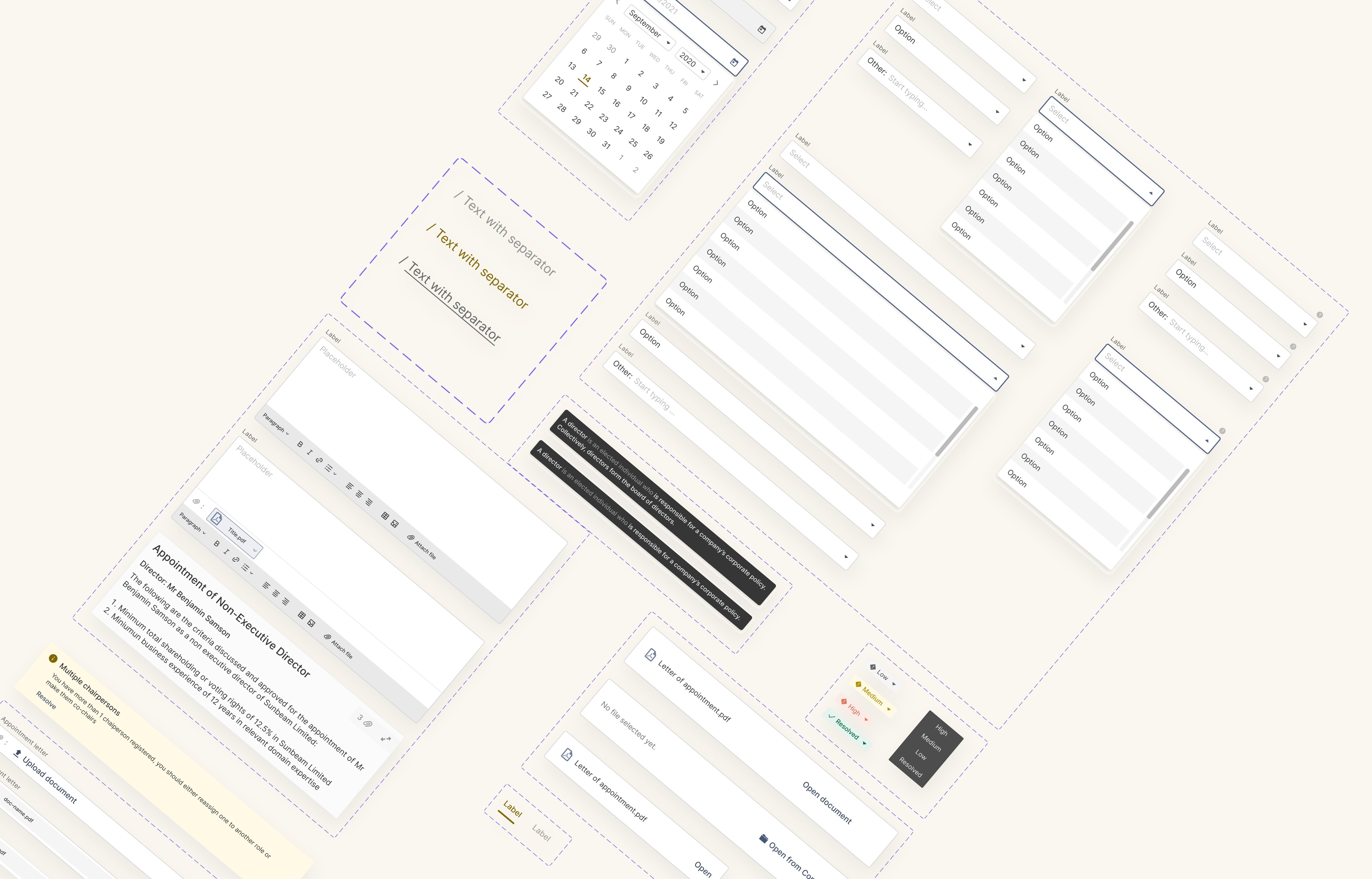
Now it was time to start designing. Since I was supposed design from scratch, I started by designing from common elements like inputs, buttons, tooltips, layouts etc. To set the tone for the design direction, with the new style and design decisions encoded into these elements.
After creating a library robust enough for me to start, I started putting the screens together, adding more common elements to the library as I go.
An image showing some elements in the stye library
For this module (and every subsequent module) we identified user groups and their goals for using the product.
There were largely 3 major user groups.
So I then proceeded to design the flows and screens for each group.
NOTE
While designing, there were a lot of wireframe and high-fidelity explorations. Periodically incorporating feedback from management, the broader product team and most importantly users. But for the purpose of this study, I would be showing only high-fidelity screens as they are sufficient to communicate my points.
For further questions you can reach me at 7ofunm1@gmail.com. Or contact me through some other channels
Sub-module 1
Creation flow
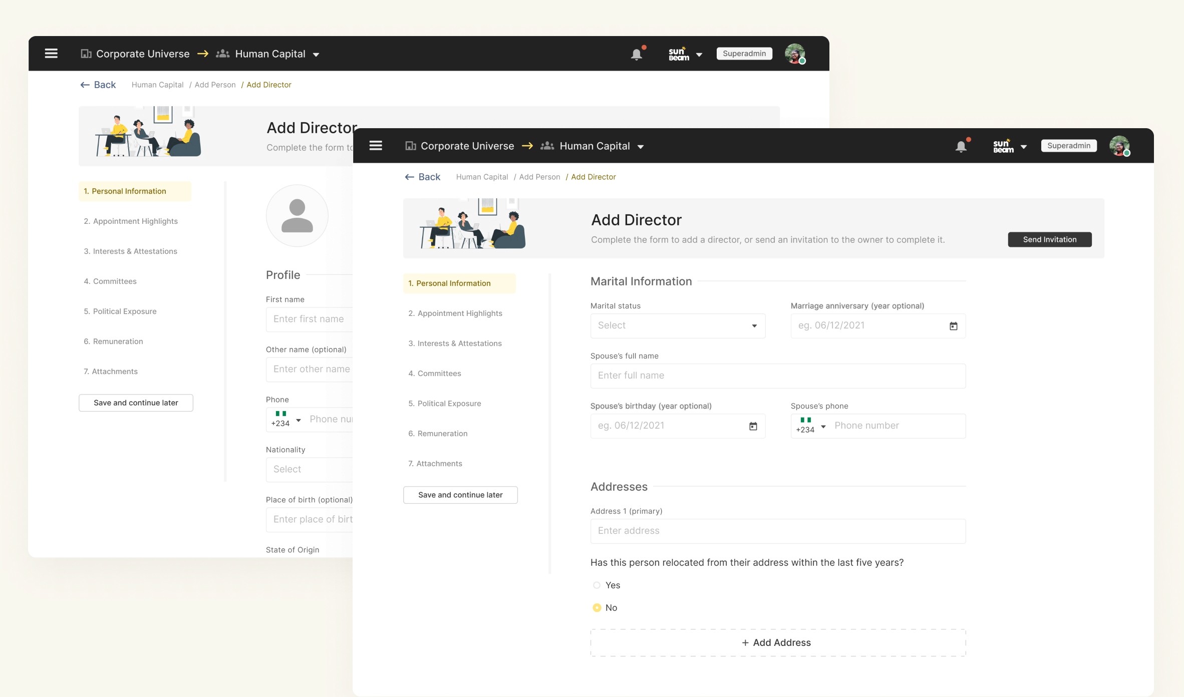
Since this was going to be a very robust repository of information about each individual member/affiliate of the organisation, it was important to segment profile into categories, and then the forms → pages → sections to prevent fatigue while filling the forms.
I also later implemented features like “Inviting the profile owner” to fill in their own data, and ‘save & continue later” to allow users save their progress for a better experience.
An image showing the profile segmentation
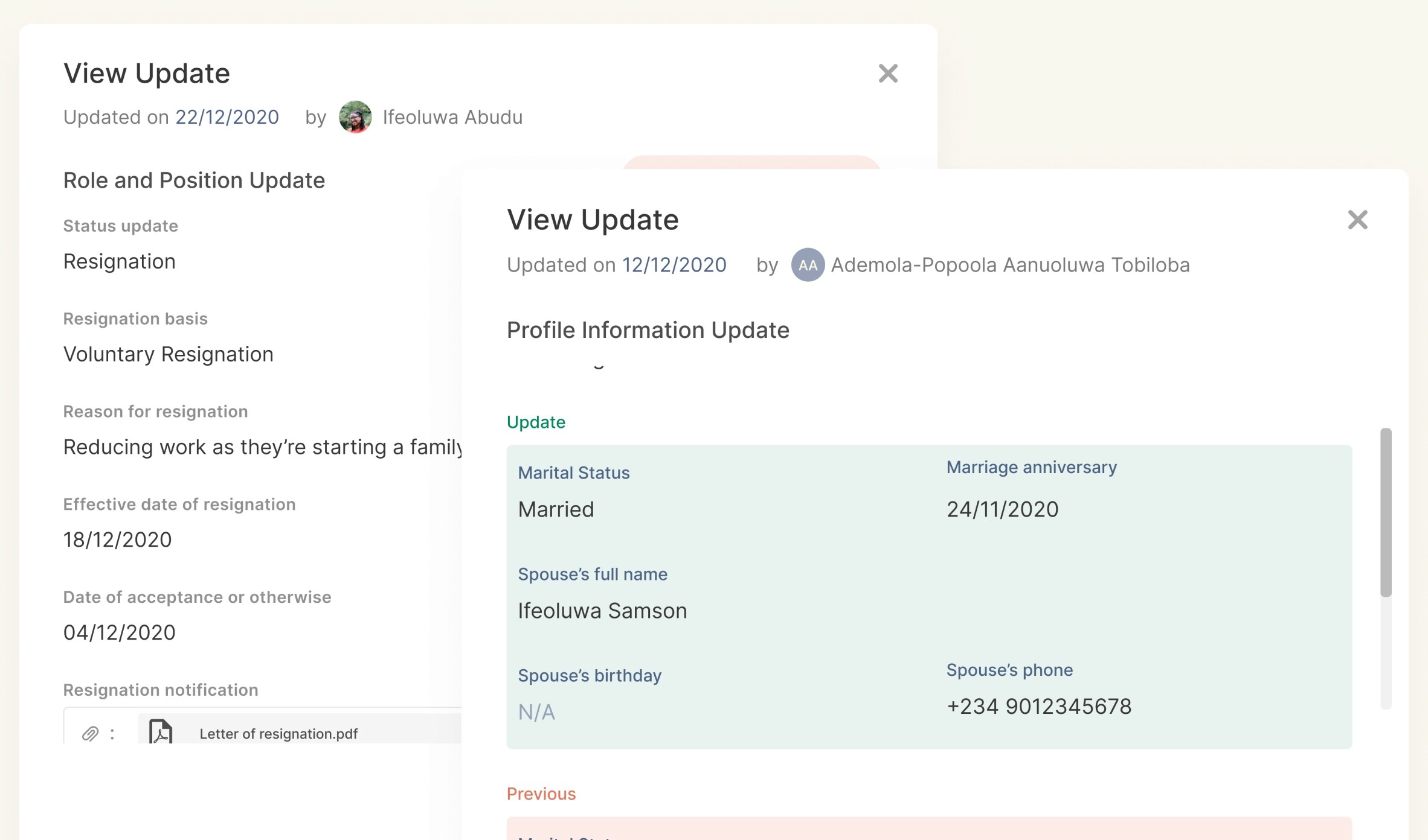
An image showing the update modals
Information management flow
This was focused in managing some complex profile statuses and changes of individuals within the organisation. Like resigning or retiring a person, or a role, or both. Since people can have multiple responsibilities within an organisation.
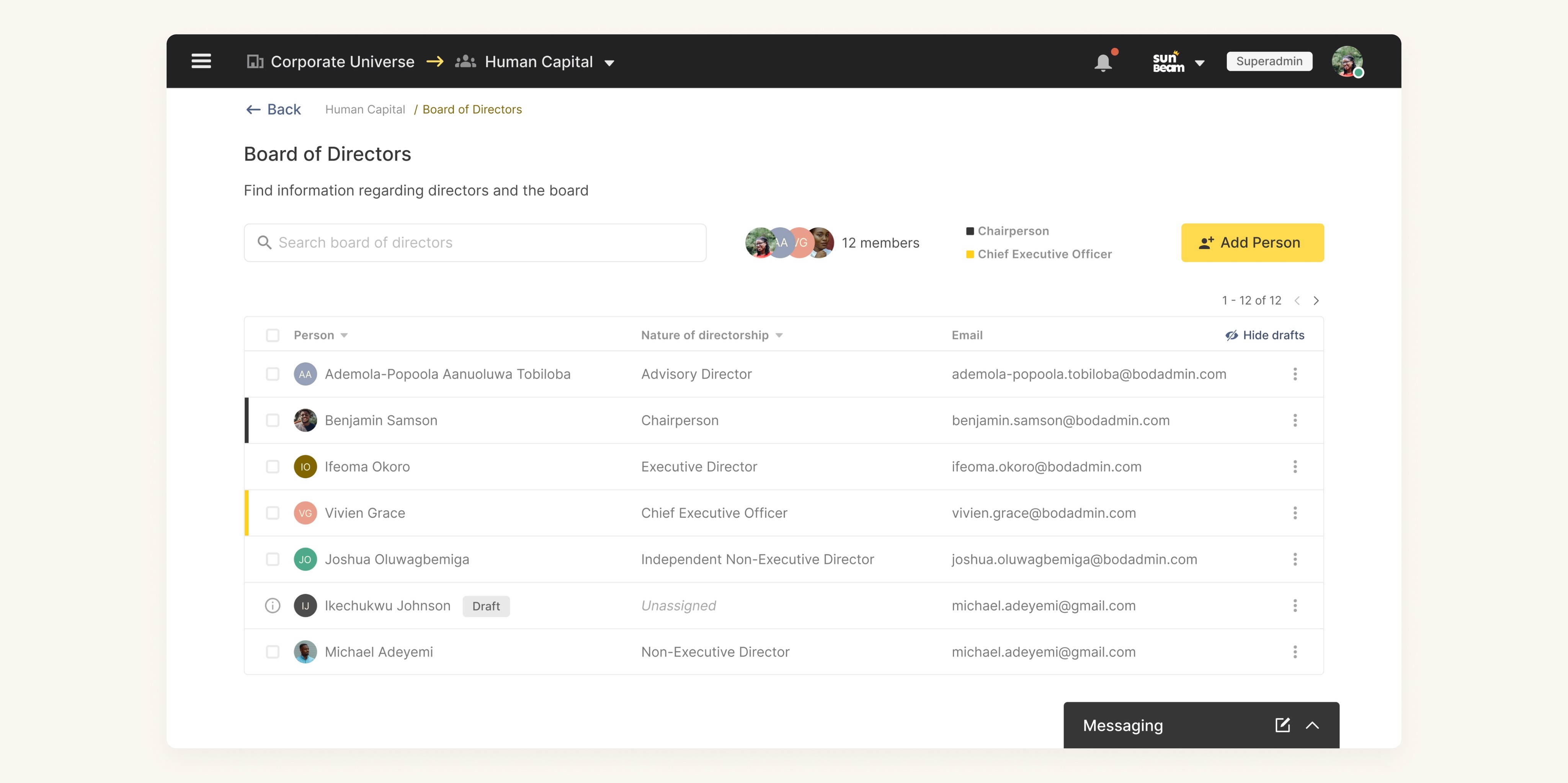
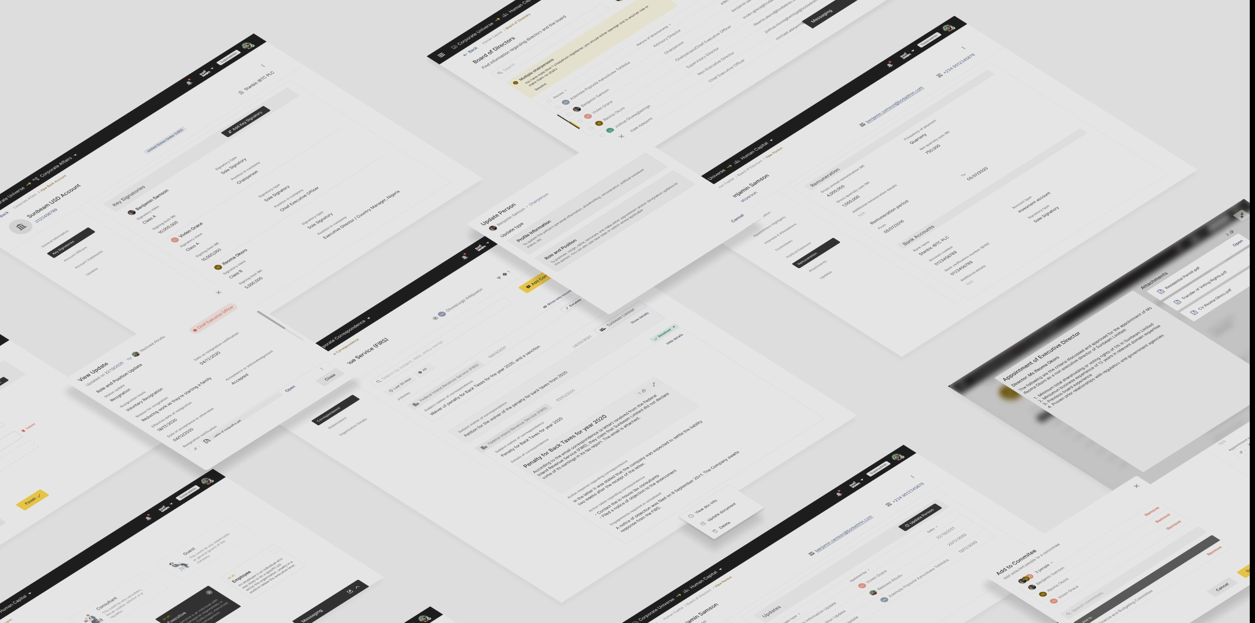
An image showing the profiles of the Board of Directors
Corporate Affairs
Focused on managing information about the organisation itself, the corporate affairs would contain mostly documents and documentation of assets and properties.
This sub-module also followed the same information creation, retrieval and management system and the flows were all created accordingly.
Sub-module 2
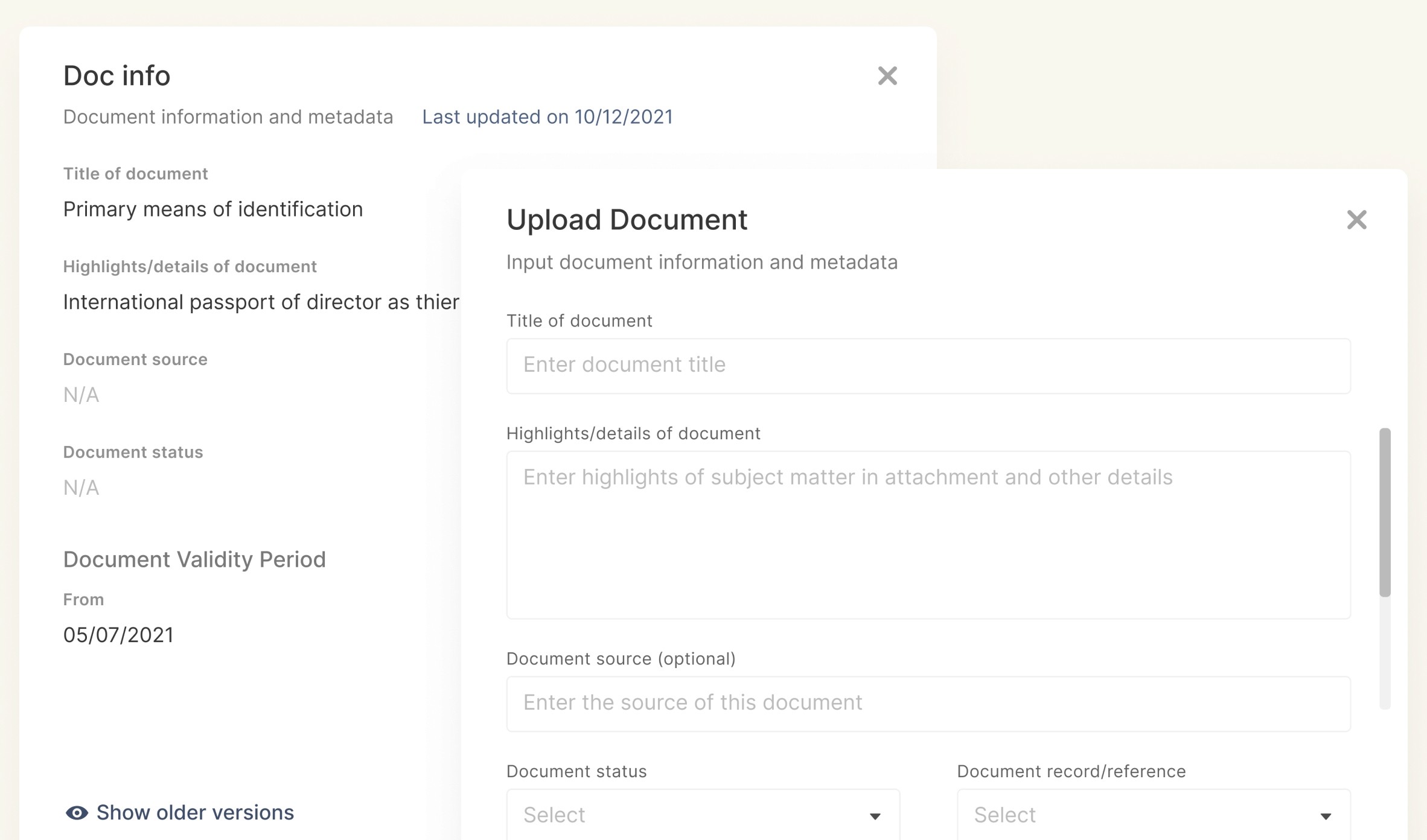
An image showing the document upload modals
To make documents uploads to the system more useful to the users, we created a system to both prevent document duplication to a reasonable extent, while also helping to provide further context (like validity) around the document
Corporate Correspondence
Focused on managing information about the dealings of the organisations through it’s external correspondence.
This also followed the creation, retrieval and management model, although the implementation was a bit different in this case.
Sub-module 3
Thank you for your time!
Next Case Study
Governance Portal
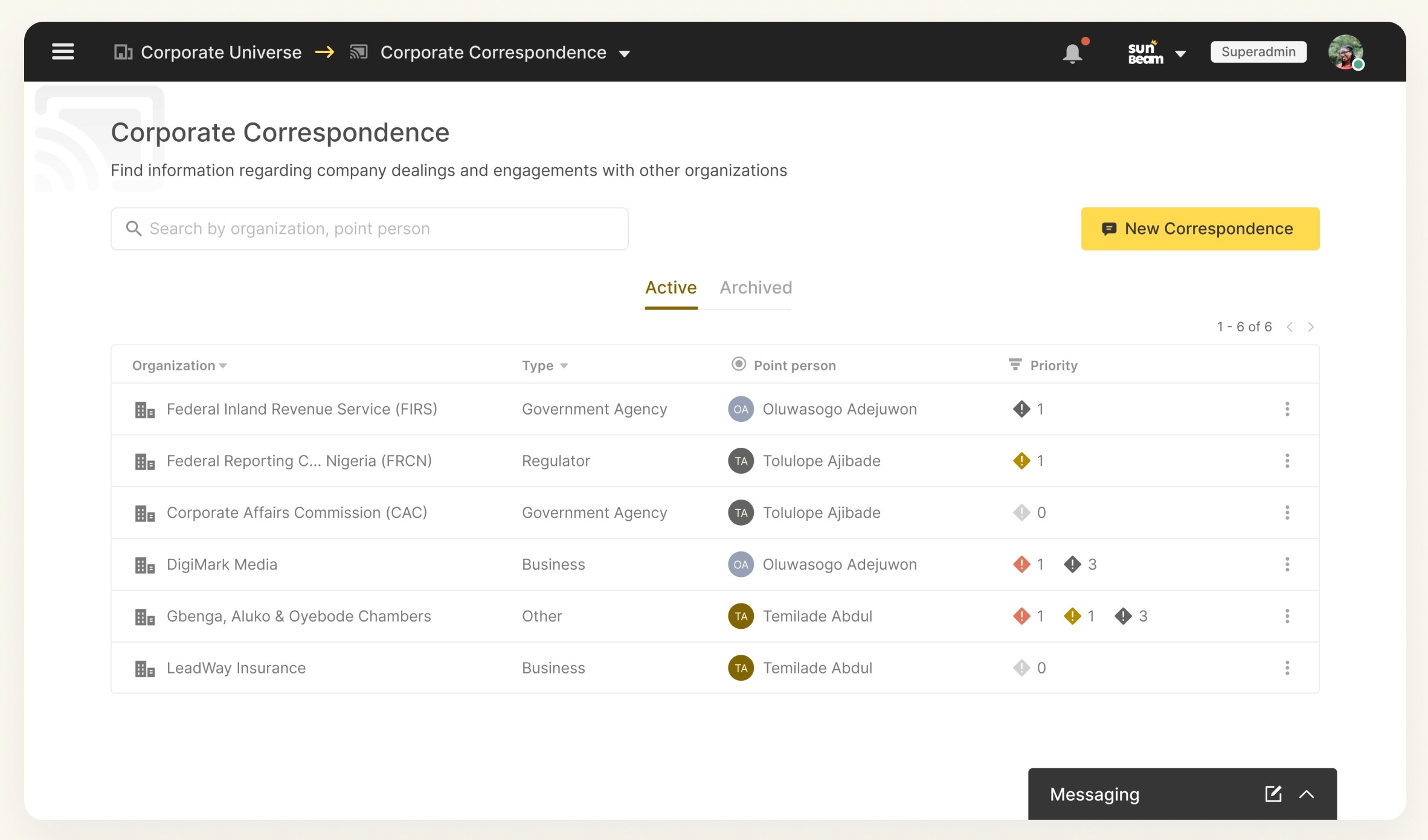
An image showing the different communications with their respective priorities
I also implemented some extra features (which came up during research) to allow priorities be assigned to, and also escalating appropriate correspondences to the right people.
Conclusion
This case study by no means exhausts all of the features, concepts and work that went into designing the corporate universe, I have only highlighted parts that show the way I approach design and UX problems.
That said, the product development process is an ever continuous one, and this doesn’t represent what the corporate universe would forever look like, as we release it to more and more people, we would take feedback. And hopefully, by the next go around, there is even more information available to make more informed decisions.

Retrieval flow
With the information segmentation already done during the creation process, the aim of this flow was to make information retrieval as easy and straightforward as possible.
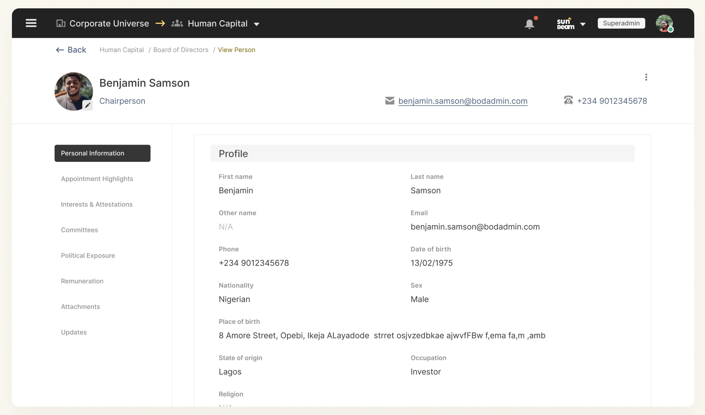
An image showing the profile of a director